Recently a local high school water polo team asked the company I work for to put a logo they found on a shirt for them. The image was previously used by a water polo team in the U.K. so obviously we couldn't print it without permission. So, I took the basic idea of a water polo ball/shark character and drew my own. It was a fun idea and I think my version came out more professional than the original one they sent us. My hope is that they will adopt it as their mascot/logo and use it for years to come.

The example that was sent to me.
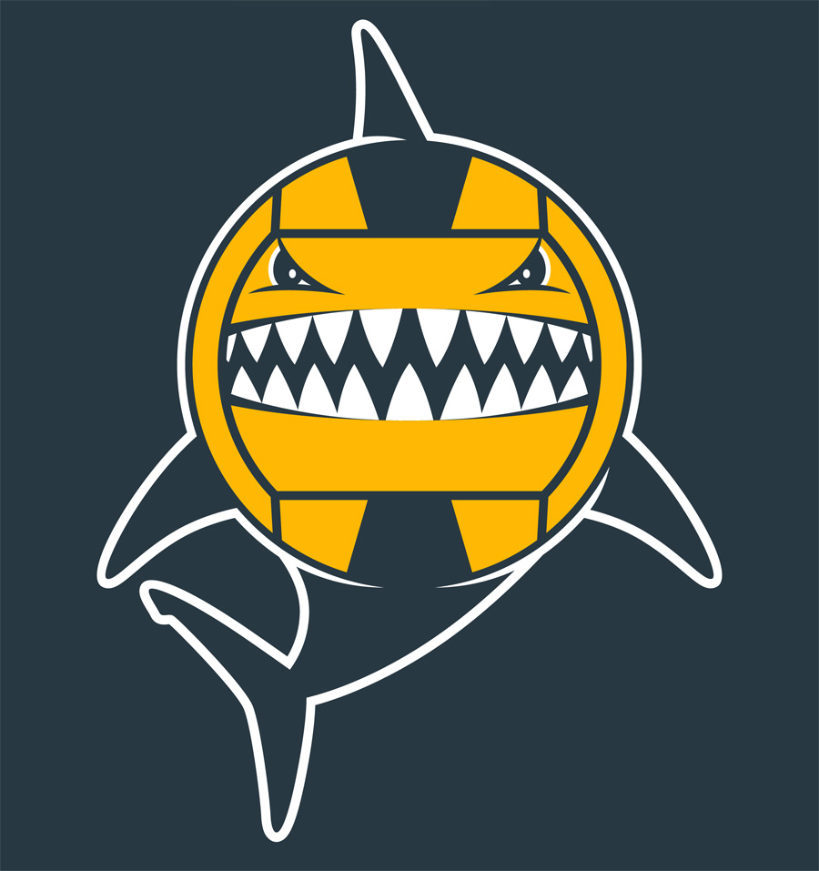
My version of the same basic idea.

This is the actual print on the back of shirts. The front turned out good but doesn't really apply to this post.