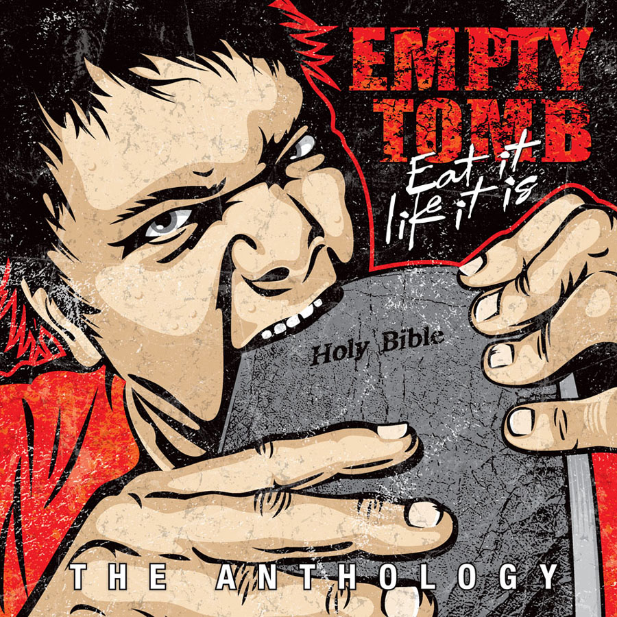
I got a package in the mail today that I've been waiting for a long time and it made my week. I received the CD release of an album that I designed a year ago and the printing looks real good.
In the early 90's I was a big fan of Empty Tomb and their brand of hardcore punk. I had discovered them the way you did back then via fanzines and odd coincidences. We shared the Northwest as our home but I had not had the privilege of seeing them play live before they were defunct. When I decided in 1995 to move to Salem Oregon a small comfort to me in uprooting from Seattle was that I knew at least a few of the members of E.T. lived there and if they did then Salem couldn't be all that bad. I made it my mission to meet the vocalist and in no time I saw him at an MxPx show and we hit it off. I'm glad to say that Feeble Man and I have been friends ever since. I not only appreciate him as a friend but he is one of my favorite punk songwriters because he embodies all the edge that I like and expect from a writer in the genre but he does it from a Christian worldview which is an unsettling and wonderful combination. With E.T.'s noise as his platform he took risks by speaking his mind in ways that still today, in some cases 25 years later, sound relevant. He took on real world issues and problems in ways that didn't make him very popular in either the churches or the gutters. But for the few who found E.T. and could appreciate them they played the albums 'til the cassette tape wore out.
When I found out that all of Empty Tomb's recordings were going to be re-released digitally I was already excited so when I got the call from Feeb wanting to know if I wanted to design a cover for the album I was in heaven. The idea for the illustration came from Feeb but he let me take license with the approach. I got to enlist the help of my son as the model for the illustration which added to the fun.
I'm very glad I was given the chance to design this cover and I hope that it sells really well so that lots of people get to hear the mighty Empty Tomb. If you click on one of the images in this post you'll be taken to where it's sold. From there you can also find where to purchase the digital download version.


