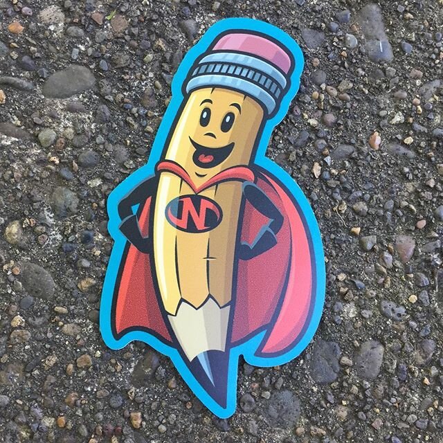
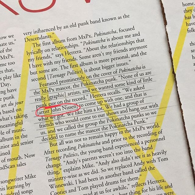
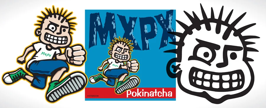
If you clicked on a link to get here or are already familiar with me then you may know that I created a lot of the original art for the band MxPx including their iconic band mascot, the Pokinatcha Punk (PxPx). I was greatly encouraged by the fantastic response to my blog post last October for the 20 year anniversary of MxPx's first album and so here I am again trying to remember what was going through my head two decades ago when I was working on their second one. I’m not sure this one will be as interesting because with that album came the creation of the mascot which made that art very special but I’ll try to make this post worth reading anyway. If you haven’t read that one from October or you would like to refresh your memory then I recommend checking it out. Here is the link. 20 Years of Pokinatcha
As has been well documented by the movie No New Kinda Story and other places the rise of MxPx happened pretty fast. I wasn’t paying a whole lot of attention to it at the time since my first son was born the same week that Pokinatcha released and my life was quickly changing. Four months after that my little family of three moved from Seattle Washington to Salem Oregon for me to start a new job. With that transition I kept doing freelance work for Tooth and Nail Records and other indie bands and labels but I was kind of clueless as to just what was happening with MxPx across the country. I knew they could draw a crowd in the Northwest when they played but I had no idea the real impact they were making until much later. When I was asked to create art for the their second album using the character again I was happy to do it and I was excited but also a little apprehensive. I’ll try to explain my hesitation.
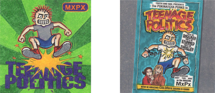
I wouldn’t call myself a cartoonist and I never have. I’m a graphic designer and an Illustrator. If my designs or illustrations have cartoon-like figures in them I love it but drawing those same figures from a different angle or in a different pose is difficult for me. I’m not saying I can’t do it and I have learned some tricks in my 27 years of professional experience but I will admit freely that it’s a struggle. Then again I believe that styles are made as much by our limitations as our strengths so I’ve learned to embrace my weaknesses in some ways instead of getting frustrated with myself. I can’t say that 20 years ago I fully grasped this idea and was comfortable with my lack of skill in figure drawing. As I explained before when talking about the creation of the Pokinatcha Punk I thought I was creating a mascot much like a sports team would have that would be like a logo that wouldn’t change. It might be hard for you to understand why this was a big deal to me but think about it this way, I knew at this point that there would likely be more drawings to do of the punk in a lot of different poses so I knew I had to figure out what his true proportions were. People who do character development figure out how many heads tall a character is and how big their body parts are in relation to the rest of their body. None of this is really important when you are drawing a one-off character but as soon as you draw him in a different pose it all of a sudden becomes very important. At least it seemed crucial to me. I ran into this before Teenage Politics when I tried to draw him skating and jumping for the insert of Pokinatcha but now that he was going to be featured prominently on another cover that would be in stores and in ads all over the country I took it much more serious. For instance if you look at the original drawing and you see how big his hand in the foreground is and how small his hand in the background is how do you determine how big his hands are when he is standing with his arms at his sides. I don’t know about you but I have no idea. So I had to decide that although the first pose was great I would just have to do my best to keep the character consistent but that it wouldn’t be “perfect” and that would be okay. I feel like since Teenage Politics that the poses have felt more like they belong together because I always look back at that one when I’m drawing new ones. Even though his foot in the foreground is gigantic the rest of his body is more normally proportioned. That helps a ton. Basically the Teenage Politics drawing became my new standard.
The other part of the poses that I should mention is the PxPx's head. I had worked with some licensed characters at my first graphic design job where we kept the head the same on every pose and I thought that though it was kind of weird it also was great that way. So, I decided to flip it back and forth, rotate it, and move the pupil around but other than that I didn't redraw it. The only exception to this that I have drawn (others have redrawn his head) was on the inside of the Slowly Going The Way of the Buffalo booklet where I redrew him for legal reasons but even on that his expression and the viewing angle of the head is basically the same.
Here are some of my thoughts about the Teenage Politics art as I remember them.
• THE GENERAL IDEA - When I looked over the song ideas that Mike Herrera had sent me and thought about the title I got the idea that teenage politics was not necessarily a good thing so it needed to be destroyed. I don’t know if I was right about that but when I presented a couple pencil rough ideas of the art to the band and label they went for the smashing one. The other idea that you can see below is one of breaking the chains of teenage politics which later got turned into a poster. That one was very influenced by my love of old sci-fi and monster movie posters.
• THE STOMPING POSE - Since the idea of smashing the type had been settled on I had to figure out how best to draw the Pokinatcha Punk stomping. I had my wife shoot a Polaroid picture of me so I could see what the body should look like. This was before digital cameras were common so a Polaroid was a good way for me to get an instant shot of something I needed for photo reference.
• SHATTERED TITLE TEXT - Much like the warped type on the cover of Pokinatcha that I created with pre-digital methods the main title type on this album was done similarly by hand. I printed out the type in a straight and stacked format and manually cut it apart and glued it down so it looked shattered. I then took that and copied it bigger and did the same thing to that print. Once I had touched it up and felt good about it I scanned it and vectorized it.
• THE BACKGROUND - As I stated on the 20 Years of Pokinatcha post I was heavily influenced by the rock poster art of the time by artists like Frank Kozik. If you look at his and other poster art of the early 90’s you’ll see where I got the bright rays. I like for albums to have a defined color theme or palette so that they are easily distinguished from each other. This time I went with a bright green theme because it felt punk rock for some reason and it was very different from Pokinatcha’s blue and red scheme. As a side note, I heard this album called the watermelon album one time and wasn’t sure how I should feel about that.
• SIMPLE LABEL-LIKE BAND NAME - I used Helvetica Condensed Black because one time a snarky co-worker of mine said no one should ever use Helvetica and since I don’t like to be told what to do I promptly used it. I put it in a simple label looking rounded box because that seemed very opposite of what punk art should be which in my mind made it very punk. I put it in the upper left-hand corner because when you are flipping through CDs at the CD store (remember those places?) you would easily see it. Yes, I actually think about things like that.
• BACK MXPX TYPE - The only thing I want to say in regards to the back art on the CD is about the MxPx custom type. It was used for a while as their band logo and appeared on shirts and on the front of the album On The Cover. I inked it by drawing with the eye dropper of an india ink container. This technique purposefully makes a really nice uneven effect. The problem is because it’s hard to control and I want to control every aspect of my art it took me many many tries to get one I liked. And truthfully that one was created by taking pieces from a few and pasting them together. Once I was happy with the compiled version I then scanned it in and vectorized it. From there I squashed it vertically and italicized it a little. In addition to being used on the back It was also used on the spine of the CD and Cassette.
Back of Teenage Politics CD packaging and front of the On The Cover album art.
Some of my attempts at an inked logo-type.
• I DON’T REMEMBER - Here are some things that I wish I had a cool story for but I don’t. Why did I put the band’s name in the shoe tread (although I really like that part)? Why didn’t I draw PxPx with shorts on this time? Why did I think dark purple letters would show up against dark blue pants? Why did I twirl the art on the CD like it’s going down a drain?
THAT'S MY STORY AND I'M STICKING TO IT
That's all I can remember art-wise about Teenage Politics. I am very thankful for the chance to work with MxPx in those early years. I feel like I was in the right place at the right time with the right desire and experience to help out a band I was excited about. Things changed for me after this album because the next one which was On The Cover was laid out by the label and they decided to hire Coop to do the art for Life In General. I couldn't be upset about that because I think it turned out great. When I finally was brought back the band and Tooth and Nail Records weren't getting along so good. So I ended up doing Let It Happen for Tooth and Nail and some concepts and an internal drawing for A&M Records for Slowly Going the Way of the Buffalo. After that Tooth and Nail hired me to do some poses of the PxPx which later got used for Ten Years and Running and the deluxe edition of Let It Happen. Then they all stopped calling me and I got busy with life and we didn't work together for over 10 years. Then last year Chris Bartch found my portfolio website and contacted me. Chris helps the band with their social media and is the fan club ambassador. He asked me to do a 20 year anniversary version of the Pokinatcha art and the rest is history. I'm glad to be back in contact and working with the band again. Thanks Chris! My wife and I went to see them play last month in Portland and it was really fun seeing them again. It was a great show and they were really warm and welcoming to us. My hope is that they keep making music and that once in a while I get to design something for them. That would be great.
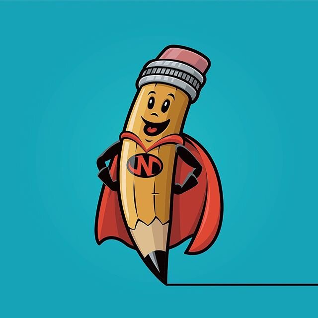
Below is the redesign of the Teenage Politics art for stickers and whatever and additionally there is a one color version of it that I did for t-shirts.
I hope this was worth your time to read. I know it's a limited amount of people who are interested in my ramblings but for the few I thought it was worth the effort. You can let me know what you think below as I've thought about doing one of these for the Tooth and Nail Records logo or for Blenderhead's album Prime Candidate for Burnout but if there is no interest then I won't waste my time.
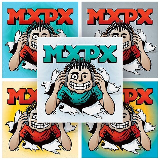
The anniversary art I designed.
Click on an image below to find me on Instagram.
