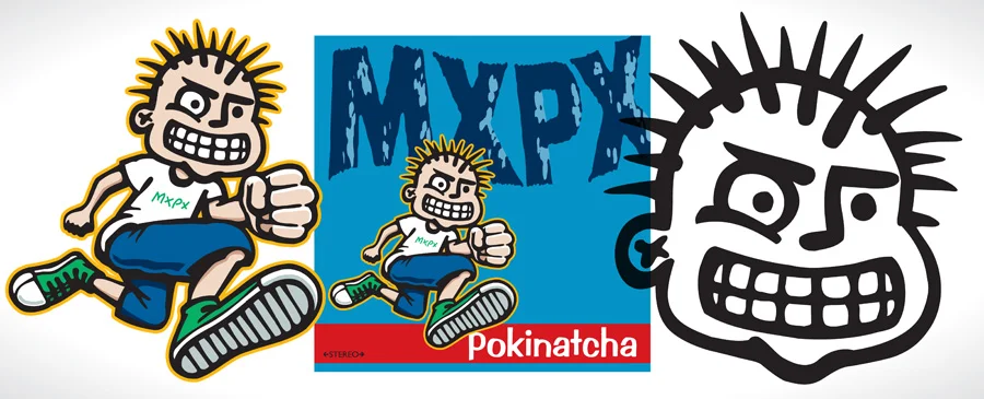
If I would have known back then that the mascot I was creating for the band MxPx would still be used 20 years later, I probably would have over-thought it and had a massive creative block. Instead, I was having fun drawing a character for an album cover for three 16 year old punks. I just hoped it would help them sell some albums and maybe the art would end up on a few t-shirts and stickers. At the time that I was asked to design the cover I had already done a few jobs for Tooth and Nail Records like the label's corporate logo and an album cover for my buddies in Blenderhead. I jumped at the chance to work on more projects for the new company and especially for MxPx. I had seen them play a few times already around Seattle and knew they had something special that would carry them pretty far. Obviously I didn't know at the time how right I was or how hard of workers they were. I would have never guessed I would be writing about that first album 20 years later and that they would still be an active band.
I grew up being a rabid fan of music and especially 70's and 80's Alternative Rock and Punk back when it was new. I didn't pursue playing music after a failed attempt at trumpet playing in 4th grade and some embarrassing experiences in an all-boys chorus in 6th grade. I was fascinated by the connection between the visual art and the music though because, I was much better at drawing. Like most of us who grew up with vinyl and cassettes, I stared at the album covers while playing the music and considered the two inseparable. In fact, I'm pretty sure my love of design started when I saw amazing iconic band logos for bands like Black Flag, Dead Kennedys, DRI and Flipper to name just a few. My heroes were as much the artists who designed the album covers as the artists who made the music. I was in awe of Raymond Pettibon because his art was so much linked to Black Flag's image that he was like another member of the band. When I finally got a chance in my mid 20's to design art for local bands who I really liked and who were getting pushed nationally, I was super excited just to contribute my part.
For a while now I've wanted to explain certain decisions I made about the creation of the Pokinatcha Punk (PxPx) character and the Pokinatcha album cover. With the 20 year anniversary approaching I decided that if there was ever a time to do it then it's now. Also I received some much needed encouragement from a big-time MxPx fan named Chris Bartch. This is my longest blog post yet, but hopefully if it's interesting to anyone out there then it will be worth my time and effort. Most of this I've never shared with anyone. It's not for any good reason but mostly because no one ever asked me. Hmm, I wonder if that's a hint.
• ART STYLE & POSE - At my day job we had just been working on humorous, fake, team mascots for a clothing line and I really liked the idea of a mascot for a band. Mike Herrera had mentioned to me that he liked the album art for Screeching Weasel and I knew they had a cartoon-like character. So I tried to create an animated guy who would represent the band. As one example, think of Notre Dame. They have the Fighting Irish mascot. He is a clean, graphic mascot that represents the University and they don't change his fighting stance pose. That's the kind of idea that was in my mind when I created the first image. I made him running and used extreme foreshortening to create movement and make him dynamic. I didn't and don't today consider myself a cartoonist, but drawing a logo-like character was very doable for me. If I do another one of these posts about Teenage Politics, the second album, then I'll go more into detail about my struggles with creating other poses of the PxPx.
• EXPRESSION - I just looked back at my sketch book from this era and almost every character I drew was clinching his teeth. I must have thought it made them look intense. I made the PxPx smiling though, because I wanted him more mischievous than mad or in pain.
• HAIR STYLE - I had seen Mike Herrera wearing his hair in spikes that were held up with rubber bands and so I just drew the punk with a more extreme version of that.
• NON-SYMMETRICAL EYES - My favorite comic strip growing up was Bloom County and I always loved how wacko Bill The Cat looked with one eye way larger than the other. That's the only explanation I can think of for the weirdest part of my character.
• X EARS - I feel like I had seen this done before, but now I can't think of where I saw it. In my weird way of thinking I thought putting an X there instead of drawing a more complicated ear was more punk rock. It also doubled as a possible earring. I tried this again on an illustration I did for the band Shorthanded where I put an X on the guy's arm to represent a generic tattoo, but it just confused people and some thought it had something to do with Straight Edge which it didn't.
• CLOTHES - This might seem obvious but there were so many ways I could of gone with his apparel. So, I dressed him like I dressed when I was a youngster going to shows. I never understood why there were so many punk kids with leather jackets and Doc Martens because I couldn't afford those things. I also wanted him to be timeless and I figured Chuck Taylors, a white t-shirt and basic shorts were going to last. It was the 90's so I made his shorts baggier than I would now but that was the style skaters were wearing at the time. He's wearing an MxPx shirt because he himself is a fan of the band. I wanted the type on his chest to feel hand-drawn but since the rest of the art was so clean I built it with a few vector lines just freehand clicking with my mouse.
• ALBUM COLORS - I'm pretty sure I was heavily influenced by the Black Flag covers done by Raymond Pettibon as referenced above. He used flat bright colors. I was attempting to make the CD pop off the shelf when it was competing for attention at the stores. I was also influenced by the screen printed poster art that was getting hot in the early 90's by artists like Frank Kozik who used super bright colors. The red and blue were specifically picked because I loved the way those colors clash when they are right next to each other. I had played with this kind of op art before and wanted to try it again.
• PUNK & WAVY TYPE - I probably should of stuck with straight type, but I thought having it warped would give it more movement. There was probably a way to do this effect in Photoshop even back then, but I had learned to do this, pre-digital, by rotating the paper on the photocopier as the light was passing over the image. Also, the effect of the rough type was created by repeatedly copying it over and over until I got the desired effect. This is how much of the "punk" type was created back before there were "punk" fonts to buy. The song list on the back was created this way also.
I feel very fortunate that I got to create something for the music industry that is still being used 20 years later. I wouldn't say that the Pokinatcha Punk is as famous as a lot of other band logos or mascots, but I've got a taste of what it's like to have a piece of your art take on a life of it's own all over the globe. I know that there are fans that associate my art with MxPx like I mentally link the visuals with the music of so many of my favorite bands. It's wild thinking about kids sketching my art on their pee-chee folders or fans wanting to get it tattooed on their body. I give much credit for the endurance of this art to Mike Herrera and the rest of the band who have worked hard to keep their music and my art alive. Thanks to Brandon Ebel for originally asking me to do the work.
T-SHIRT DESIGN TO CELEBRATE THE 20 YEAR ANNIVERSARY OF POKINATCHA. YOU CAN GET ONE AT MXPX.COM
If you want to see more of my art for MxPx or find out what else I've been doing for two decades you can start by clicking my JND logo at the top which will take you to my homepage or look through more of my blog.
Thanks for reading this far and making my effort to put this down in words worth it.


