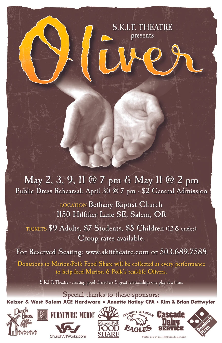
In my spare time I've been working on designs for a production of Oliver that my son is acting in. I got the printed posters, tee shirts and the yard signs all last week.
The full poster
My son modeling the shirt
I decided on the tee shirt and yard sign that I would not include the vintage texturing in the art but instead go with a more clean look. On the shirts I was concerned about the hands printing good anyway so I thought adding more texture to them could cause problems and make the hands look like they had lines on them like older or weathered hands. Since the hands are supposed to be those of a young boy I thought I better not risk the weathering making them look older. I think I made the right choice. With the yard signs I thought it would be better to keep them as simple as possible since they are supposed to be read from a car as it goes by.
The yard sign
The printing on all three pieces turned out great and I'm pleased with how they came out. Now I just hope that they do their job and bring people out to see the show.


