Recently a local high school water polo team asked the company I work for to put a logo they found on a shirt for them. The image was previously used by a water polo team in the U.K. so obviously we couldn't print it without permission. So, I took the basic idea of a water polo ball/shark character and drew my own. It was a fun idea and I think my version came out more professional than the original one they sent us. My hope is that they will adopt it as their mascot/logo and use it for years to come.
The House of Learning
My church changed the name of it's adult education ministry and wanted me to design a logo for it. The design needed to communicate academics without looking too serious but it also couldn't look too juvenile. My challenge was to make it look like there will be learning involved but keep it friendly and inviting. The final logo is below and below that are three of my favorites of the options I showed them in the first round of sketches. I used the font Paralucent on a lot of the options and on the final to match the logo for the whole church that I helped design a few years ago.
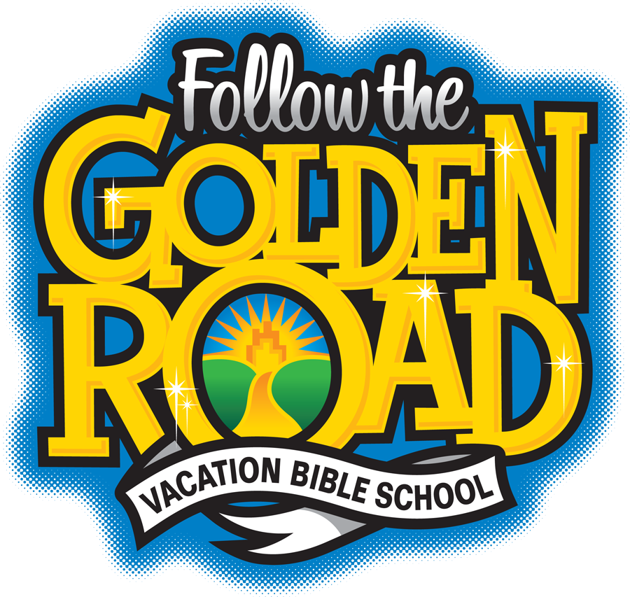
Follow The Golden Road
This year my home church is basing the theme for it's summer Vacation Bible School on a very loose adaption of the Wizard of Oz. I had the privilege to design a logo for it. I have said before and I'll say it again that I enjoy working on logos for kids because it's just really fun to me. Below is the finished logo.
I really hope there will be flying monkeys in the skits and that my son gets to play one.
Nissen Coffee Gift
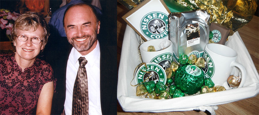
Last Christmas I had the idea of making my parents a special gift by adapting their favorite coffee brand and making it unique to them. I started with a photo that I had of them that just happened to be sitting on a shelf behind my desk chair. I drew from that photo a high contrast version of them. I tried to make it simple and logo-like with out getting too hung up on making it look like a knock-off of the siren image. I knew that once a black and white image of them was placed inside the iconic green ring that they would probably be really happy with it.
Here you can see the original photo and the final basket of goodies that I put together for them. I put aprons on them because it seemed appropriate and I added a hand and arm holding a cup of coffee to fill a weird space that was created at the bottom of the circle.
The most important part of the gift for me was the mugs which I had printed through Costco. I also thought it would be neat to give them a Christmas ornament with the logo on it which I sourced through Zazzle. The rest of the items where modified by me to add to the overall effect. I bought candy and coffee that had similar packaging colors and added the logo to the labels. I also printed the logo on a card that I wrote in.
Below are my parents opening the basket. They thought at first glance that it was a basket of Starbucks stuff and then were very surprised to see that it was actually them on the items. It was fun to see them open it.