My church changed the name of it's adult education ministry and wanted me to design a logo for it. The design needed to communicate academics without looking too serious but it also couldn't look too juvenile. My challenge was to make it look like there will be learning involved but keep it friendly and inviting. The final logo is below and below that are three of my favorites of the options I showed them in the first round of sketches. I used the font Paralucent on a lot of the options and on the final to match the logo for the whole church that I helped design a few years ago.
13 Songs For 13 Friends
It wasn't long after moving to Salem that a friend introduced me to Andy Wiseman (thanks Angela Jones). He had recently started a band called Shorthanded and we hit it off right away because of our common love of all things punk rock. Andy had played bass in bands that I enjoyed like Empty Tomb and Crux. With Shorthanded he became the primary songwriter and both sang and played guitar. Right away I started doing artwork for Shorthanded and I think it was a great partnership for many years. When they signed to Tooth and Nail Records and recorded their album for the label in 1999 the record company had other ideas about who they wanted to do the album art. Although I wasn't too happy about it at least they had Mitch O'Connell do the illustration. The fact that I was a fan of his work and knew he would do a great job softened the blow to my ego. I think the whole thing turned out great, especially the recording of Andy's great songs.
Although Shorthanded has been out of commission for quite a few years and Andy has moved away from Salem we still stay in contact and have worked together on some projects (not just music related). You can see one of these in the Album Covers section of my site, it's called Truth or Consequences which is his honky-tonk band.
Andy is currently writing and recording a new Shorthanded album and just like the good old days I worked up an album cover for him. It may not come out for a while as there are some exciting people showing interest in working with him on it and I'm sure they have to coordinate all their busy schedules to get it finished but I got permission from Andy to show the art here on my site.
I had a lot of fun working on this and I hope you like it.

Eat It Like It Is CDs
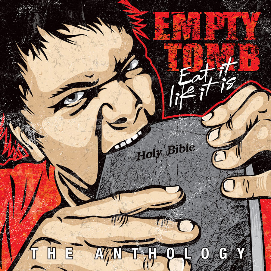
I got a package in the mail today that I've been waiting for a long time and it made my week. I received the CD release of an album that I designed a year ago and the printing looks real good.
In the early 90's I was a big fan of Empty Tomb and their brand of hardcore punk. I had discovered them the way you did back then via fanzines and odd coincidences. We shared the Northwest as our home but I had not had the privilege of seeing them play live before they were defunct. When I decided in 1995 to move to Salem Oregon a small comfort to me in uprooting from Seattle was that I knew at least a few of the members of E.T. lived there and if they did then Salem couldn't be all that bad. I made it my mission to meet the vocalist and in no time I saw him at an MxPx show and we hit it off. I'm glad to say that Feeble Man and I have been friends ever since. I not only appreciate him as a friend but he is one of my favorite punk songwriters because he embodies all the edge that I like and expect from a writer in the genre but he does it from a Christian worldview which is an unsettling and wonderful combination. With E.T.'s noise as his platform he took risks by speaking his mind in ways that still today, in some cases 25 years later, sound relevant. He took on real world issues and problems in ways that didn't make him very popular in either the churches or the gutters. But for the few who found E.T. and could appreciate them they played the albums 'til the cassette tape wore out.
When I found out that all of Empty Tomb's recordings were going to be re-released digitally I was already excited so when I got the call from Feeb wanting to know if I wanted to design a cover for the album I was in heaven. The idea for the illustration came from Feeb but he let me take license with the approach. I got to enlist the help of my son as the model for the illustration which added to the fun.
I'm very glad I was given the chance to design this cover and I hope that it sells really well so that lots of people get to hear the mighty Empty Tomb. If you click on one of the images in this post you'll be taken to where it's sold. From there you can also find where to purchase the digital download version.
Follow The Golden Road
This year my home church is basing the theme for it's summer Vacation Bible School on a very loose adaption of the Wizard of Oz. I had the privilege to design a logo for it. I have said before and I'll say it again that I enjoy working on logos for kids because it's just really fun to me. Below is the finished logo.
I really hope there will be flying monkeys in the skits and that my son gets to play one.