Before and After 2

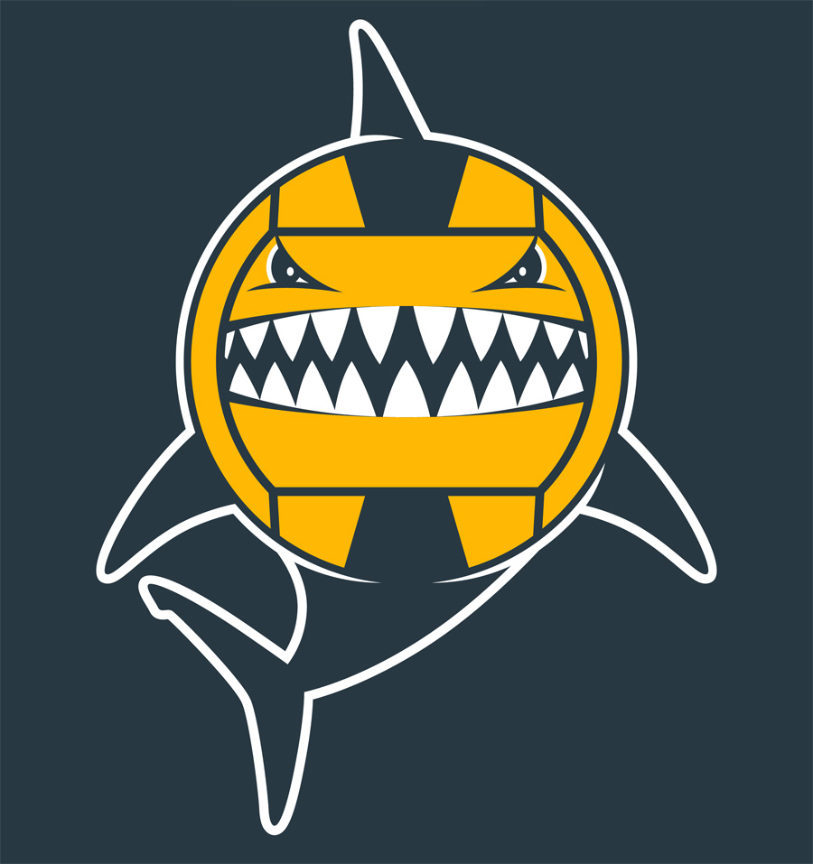
Recently a local high school water polo team asked the company I work for to put a logo they found on a shirt for them. The image was previously used by a water polo team in the U.K. so obviously we couldn't print it without permission. So, I took the basic idea of a water polo ball/shark character and drew my own. It was a fun idea and I think my version came out more professional than the original one they sent us. My hope is that they will adopt it as their mascot/logo and use it for years to come.

The example that was sent to me.

The example that was sent to me.

My version of the same basic idea.

My version of the same basic idea.

This is the actual print on the back of shirts. The front turned out good but doesn't really apply to this post.

This is the actual print on the back of shirts. The front turned out good but doesn't really apply to this post.

Before and After

Recently a local insurance agent who has been a great customer at my day job for years asked us to print his new logo on shirts for kids to wear. To my surprise his new "logo" was a piece of art he bought from 5ive Minute Logo. If you don't know what that is you can click on the name and see it for yourself but basically it's a site where you can buy a logo for $5 that takes only 5 minutes to create. This would of been fine with me since the creator of 5ive Minute Logo is a long time good friend of mine, Von Glitschka, and the art was in vector form and would print really well. Not surprisingly though the customer wasn't completely happy with his cheapie cheap logo and wanted it changed a "little". Below is the art he sent me and a picture of his jeep which he wanted it to look more like.

Nissen_WYA_before.jpg

The funny thing is that the art looks nothing like a jeep so I was going to have to start from scratch and draw a whole new image. The sad thing is that since the client had payed only $5 for his unusable art I knew I was going to have to draw the new one as fast as I could. Below is my version of the same basic style but done to look more like his actual vehicle.

Nissen_WYA_after.jpg

I originally drew the jeep straight but he wanted it going up hill so for the shirt I put it on an incline. When I gave him the file of the art I gave him the straight version because I thought it would look better for most uses. 

My conclusion about this situation was that although it bugged me a little bit that 5ive Minute Logo devalued my work to a certain extent it also provided a cheap thumbnail sketch that made it easier for the customer to communicate to me what he wanted and I had a pretty good idea of what style of art would make him happy based on that thumbnail. So, I guess I won't have to punch Von the next time I see him.